Sunday, July 12, 2020

Narayana Bhattathiri and Malayalam Calligraphy art

About Narayan Bhattathiri and his Works:

Narayana Bhattathiri is a malayalam caligraphy artist, who has exhibited his works in India and abroad.

His workshops were organized at:

Kochi Biennale 2016-17,

Callifest, Navi Mumbai,

Trivandrum, Kochi, Thrissur and Kozhikode.


He was the Festival Director of the First National calligraphy Festival of Kerala in 2019.

Bhattathiri is the receipient of the Jikji Excellence Award in International Calligraphy for 2017 and 2018.

Calligraphy work permanently exhibited in the Calligraphy Stone park, Harbin, China.

A Novel based calligraphy series (30 works) permanently exhibited in Thrazak, Palakkad, Kerala, India.

He is a regular participant at the International TypoDay Conferences for the past couple of years, and has been part of various upcoming calligraphy workshops all around the country.

Bhattathiri's Calligraphy:

In Malayalam, the romance with the alphabet has a long history; it can be found in the various palm leaf manuscripts, and later in early stone types, block prints etc. before it blossomed in print. Written, painted and printed words are a ubiquitous presence in Kerala; our public spaces are inundated with words; there are graffiti on all the walls, posters and billboards on the pillars and posts stare at us from all around. With the apparently varied ‘choice’ of fonts and the ‘freedom’ to adapt and adopt, the encounter with the shape and size, gravity and lightness, tone and tenor of the alphabet became mechanical and ‘ordinary’, over the years. Bhattathiri’s word art is an attempt to re-enchant the romance with alphabets, reinvigorating the encounter with new energies, aesthetics and playful flights.

This exhibition presents a miniscule selection from the thousands of titles that Bhattathiri has designed and drawn over the last four decades. He brings to Malayalam alphabet art a new vigour and endless innovations, by working his way through the contours and margins, the twists and turns, the dots and vowls of Malayalam alphabets. He recreates the awe and wonder of that primal encounter between meaning and word, the abstract signification and the concrete form and shape of the alphabet. His art practice is one that works with, through and around the tense and arbitrary, but deeply resonant relationship between the word and its meaning, the alphabet and its sound.

Never a conformist to any style or school, he is vibrantly eclectic in his approach to his art of shaping and moulding alphabets, curling and straightening, flourishing and chiseling them into affects, meanings, emotions, always creating, a visual impact of a visceral and striking kind. In this process, he freely plays with forms and styles – sometimes they are minimal, muted and rigid, other times, flowery and flamboyant, emotional and loud.

If one browses through the thousands of word designs created by Bhattathiri, one will be astounded by their variety. His designs approach and negotiate with the alphabet in a profound manner; alphabets and words are not mere potential objects of ‘beauty’ or defined functionality for him; instead his art intensely engages with the meanings, sign values, sound, genre (story, novel, film), and space (magazine, book, paper, poster..); these factors decide the size, shape, strokes, texture, and medium of his art work. Looking at his works, one feels the word-forms emerging out of meanings, movements, sound, affects, emotions, bhava and rasa associated with them.
He uses the alphabet styles of various languages and cultures – their shape, size, flow, serifs, ascenders, descenders, stems, finials, apex, brackets, leaps and loops, to adopt, coax and caress them into Malayalam alphabets. As a result, one can find in his work traces of postures and slants, the flows and joints of Chinese, Arabic, Sanskrit, Hindi, etc; they are employed to animate words to resonate with their cultural/linguistic roots and to make them converse with Malayalam. Likewise, his ambigrams are ‘alphabetic flights of imagination’, they are complex and fascinating creations that combine meaning and form in inimitably playful ways.

Bhattathiri’s words and alphabets rain, burn, flow, flicker, fly, fall, slide, float, frown, smile, giggle, ponder, worry and flutter, in tune with the trajectories of the denotations and connotations, that illuminate and ignite their semiotic, indexical and symbolic energies.


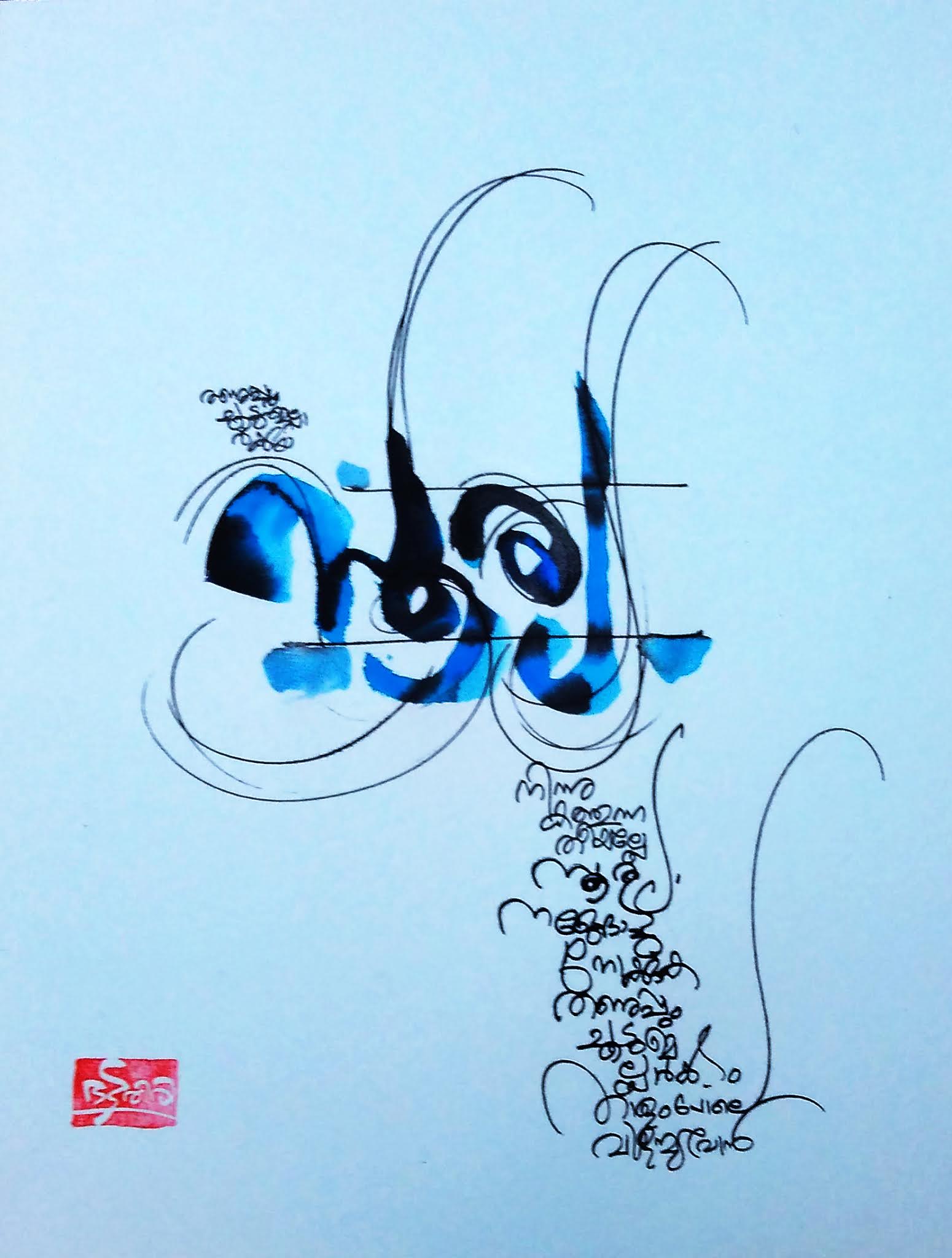
Three of Narayana Bhattathiri's Malayalam Calligraphy Works:


A few links to read further about his works: 


His beautiful malayalam calligraphy works have featured in movies, and even recently in the  Calligraphy event dedicated to the National Anthem

Kalakaumudi news report about the Calligraphy event dedicated to the National Anthem , can be viewed at the following link.


https://www.youtube.com/watch?v=al-wFCU2P0g&feature=share&fbclid=IwAR1E-6pvMsC6uURk0qE9aSowwQsXvz7wp2DJHgkk1I6YCrTOid4R0IB5_bw


He also did calligraphy works based on the novel at Thasrak, the village in Palakkad made famous by OV Vijayan’s seminal work, Khasakkinte Ithihasam, to mark the golden jubilee year of the book. For more details, please read the news by The Hindu:


Said Elatab and his daughter

Said Elatab is an Arab American visual artist born in Bierut, Lebanon. He came to the United States in 1979 as a young aspiring artist hoping to make achievements as great as his role model, the famous Khalil Gibran- (writer, poet and visual artist).
By the tender age of 15, Said's interest in visual art became more of his obsession. He studied the works of great artists such as Van gogh and Picasso. Van Gogh's works so impressed the artist that he painted the starry night in Jerusalem to show his admiration for the great work. Said says " The one that inspired me the most was Van Gogh. He was a miserable artist. He received great failures in the pursuit of his fame. Unfortunately he sold only one piece of art before he died and never got any rewards of being famous. Another artist I admire very much is Francis Bacon. An artist who lasted through 6 decades. He too, died a miserable artist, a homo sexual, an alcoholic. Before committing suicide, he was able to leave behind many famous works of art, such as the one called "Crucifixion". I want to paint with passion always."
It took a few years for said to develop his art and making his style. His style has a middle eastern influence combined with the influence of his role models. Like Leonardo Da Vinci's Mona Lisa, Said became affixed with the face of his love, which reflects in some of his paintings. His passion to express pain of this relationship is represented in some of his best works. His world revolved around his muse, and his loved ones. The angst of losing ones dear ones is when a person comes closer to the concepts of detachment. Some of his beautiful works were lost forever like the loss of one's precious part of soul, in such a state...
The human plight around also makes itself visible in some of said's works on the corona pandemic. The artist has been working for around 45 years by now. His works are exhibited in the galleries of United States and Lebanon. Said also worked as a war photographer during the Civil War in Lebanon and the war in Afghanistan. He also became a photographer for Paparazzi. He now has turned to his passion for oil paintings.


Choice for Curator's Pick: The pleasures and turmoils the artist saw and endured in his life plays a hide and seek in the subjects of his painting. It has a masculine expression of woman's feelings/expressions. Sensuality too pops up in a few of the works. But apart from all this, the strength in which the artist stood up during adversities and lives ... This exhibition is also meant as a memoir for his children, especially to his brave Amar Elatab. 

Article on Said Elatab, by Bindu P V in the Malayalam Monthly Magazine, 'Prasadakan'


Roy Mathew Thottam Sj

Born in 1965, Roy Mathew Thottam has an educational concotion of being graduation in economics , post graduations in folk lore (MA in Folklore, M S University, Thirunelveli) and Fine Arts (MA in Fine Art- Painting, Canterbury Christ Church University, UK). Some of his important painting exhibitions are:
2003- German Lutheran Church, Delhi,
2008- Sydney Cooper Art Gallery, Canterbury, UK
2008- St. Katharine Hospital art Gallery, Unna, Germany
2010- Church Art galleries in Munich, Gottingen, Frankfurt , Aachen in Germany
2008 - Canterbury Art Fair 2008, England (group show)
2009- Green Orange Art Gallery, Kochi
2012- Embassy of Hungry, New Delhi (group show of Art i)
2011- Kerala Lalitha Kala Academy , Trissur (group show of Art i)
2014 – ‘The Quest’, painting exhibition, Durbar art Gallery, Kochi
He has conducted many art workshops and art appreciation courses. He wrote many columns and articles on art in various periodicals and publications and is editor for a literary and cultural magazine- 'Ezhuthu’. He has also written 'A study on Kerala church murals', and contributed articles on Kerala Church mural tradition in national and international publications.

Artist's Statement - Artistic Process

‘Art is not about art’ said British artist Cecil Collins. Art is about everything and about nothing. It is there in our life in both ordinary and extraordinary realms.
I am interested in the psychic and spiritual process involved in creative activity. There is an urge in everybody to get in touch with our real ‘self’ and to give expression to it. For me it is a journey towards the ultimate freedom of the ‘Self’ which I consider as a spiritual process. Spiritual is that impulse within us to transcend ourselves and our experiences; and an urge to go beyond the obvious to the ‘true and pure’. Art itself is a process of going beyond.
‘The vocation of the artist is to create vision and the purpose of vision is to awaken man’s real self, for in art there is a hidden inviolate instinct for freedom, for eternity’ (Cecil Collins).
Now a day the modern world has made us too false to ourselves. The individual has lost identity in the post modern society and is faced with inner chaos and vacuum. It is the challenge of modern man to search true self in between these realities; as Donald Kuspit says,‘ to make art is to be caught in a trap- in a vicious closed circle of creative birth and death- the rebirth of authentic selfhood and the living death of self falsification’ (Kuspit, Signs of Psyche in Modern adn Post Modern Art, 1993, p. 178).
Artist’s inner world of feelings and emotions, at times conflicting and complementary, become more important than any subject. Art transforms crisis into creative freedom, it becomes a life giving force. It is a process of liberating our Self from the social disguises and pretensions, revealing it in all its expressive nakedness. Expressions with certain madness reveal the primitive depth of the psyche.
- Roy M.Thottam SJ


Govind Viswas

Govind Vishwas from Bhopal, did his Masters of Visual Arts (MVA) in Painting, Bachelors in Visual Arts from The Maharaja Sayajirao University, Baroda 2010-2012. He has also studied Bachelors of Fine Arts from Govt. Institute of Fine Arts, Indore(GIFA). Govind has co-curated and participated in many group shows and workshops and conducted many solo shows.

He has won the prestigious Pollack Krasner Foundation Grant Award, New York, USA 2012 and in 2018.
His works are present in:

• Govt. institute of fine arts, Indore.
• ITM university, Gwalior
• Private collection in, Bhopal.
• Collection at Bharat bhavan museum, Bhopal.
• Collection at Rajeev sethi private museum , New Delhi
• Austria, London, USA, Bangalore, Mumbai, Baroda

Artist's statement:

My work is oriented to the exploration of natural phenomena and their impact on the physical environment. The relationship between growth and transformation and the complexity of the structures they engender, guide my practice. My earlier works based on time and space. The brand logos and various other symbols we come across, suggest some directions, time, volume or scale. The imagery is suggestive of landscape elements and textures with multiple readings. Forms are used to express aspects of reality or failings, which other can easily connect to visual forms, are also a kind of language that people connect to more easily.
My works Space is important to me, and in my life. My family also faced re-habitation during the separation of Bangladesh in 1971. I heard lots of story form my grandmother. My earlier works based on time and space. The brand logos and various other symbols we come across, suggest some directions, time, volume or scale. The imagery is suggestive of landscape elements and textures with multiple readings.
Just the way we learn a written and spoken language, so do we learn a visual language. Culture plays an important part in this.
A map is a visual representation of an area. Maps may represent real or imaginary space. They may be dynamic, interactive, two or three dimensional. In many images, some maps represent real, physical space which exist and some don’t.
Most of my new works are also related to personal space and incidents. They reflect various issues that I have been dealing with.
Land has been in focus in my family for reasons of dispute.
I work on many pieces at the same time. I go back and making installations, wall works and drawings. I work either in small or big scale. I feel that this organic process of making things, allows me to do research, to challenge myself and to renew my work constantly. I get my inspiration through nature, architecture and design. Following the phenomena of the universe, I induce movement in materials in order to create natural architectonics. I focus on their specific properties color, structure and plasticity through manipulations layering for growth and accretion. The fluidity of molten rubber is symbolic of the ease of living and various life processes, it also conveys movement. Spatial temporaity is a recurring motif in these with motley objects in unknown hybrid environment pulsating with raw energy.


Anirban Sheth

      The beginning of 20th century saw a trend to revive the crafts in Bengal. One of the arts revived in the period was the leather art work, in the areas near Shantiniketan. Rabindranath Tagore and his wife his wife Protima Devi, along with artists like Nandlal Bose, and craftsmen inspired the youth to practice this craft and be innovative in it. The leather craft of this area has embossed patterns and batik work is done on the leather. These leather craft uses embossed batik painting along with traditional patterns.  The handcrafted leather of this region which is available in different colours, patterns and with traditional motifs, is famous. This is a distinct trait of this leather craft which is world famous today for their artistry as Shantinikentan leather craft.  This craft inspired Anirban Sheth, an Calcutta based artist who grew up watching batik images crafted on leather by artisans at Sriniketan, an extension of Santiniketan.

Anirban started painting when he was 16 years old. He is a first class graduate & master degree holder from Government College of Art & Craft, Calcutta University. He took the craft of Shantiniketan leather art to a different level, where the craft has turned to art pieces. According to Ratnottama Sengupta, ARTS EDITOR, THE TIMES OF INDIA,  “Albrecht Durer is known to have executed some memorable images on vellum. African and Australian Aboriginal artists continue to use it as a mode of their creative expression. Indonesia, and Malayasia, used it to create aesthetic figuration.” Leather puppets were used in south Indian states for the performance of Tholpavakoothu, Bommalata etc. Anirban has done Twenty solo exhibitions along with various invited group shows in different galleries all over India & abroad. He has received twenty one special awards including –“ AMERICAN ART Award 2018” [6th Rank], West Bengal State Award for painting from Prafulla Dahanukar Art  in 2018,   Mridula Lunker Award-2014 by  “ICAC Gallery” [International Contemporary Art Centre, Mumbai] in 2014,  Oriental Art Society Award in 2003,  Prestigious Camlin Art Foundation, East Zone Award, (Professional Category) Kolkata, with award money in 2001 etc. His collections are in places like- Jehanjir Art Gallery [Mumbai], Birla Academy (Kolkata),Lee-Alison Sibley[U.S. Consul general ],Mani Ratnam [Eminent  Film Director], Art World(Chennai),Aurodhan Art Gallery(Pondichery), Tata Steel, Emami Limited,  Marble Palace (Kolkata),  British Deputy High Commission & Many Private, Corporate & Institutional collections, Like – India & Abroad  [ like- USA, UK, CANADA, PARIS, GERMANY, RUSSIA, HONGKONG, SPAIN, SINGAPORE, THAILAND, BANGLADESH, JAKARTA etc]. His exhibits have been highly appreciated among the art critics and media and also from “GUINNESS WORLD RECORDS”, London. U.K. [ Membership Number:24492, Claim ID: 32422].


Why did he choose this medium?

Anirban was attracted to Shantinikentan leather craft. He was fascinated by the special effect that one is able to create on leather but cannot create on paper or canvas His unique way of painting on the leather comes from much research. The leather is the support of the painting. It also forms a inherent texture which is heightened by special techniques such as batique painting, embossing etc. He heightens every accidental effect through the use of leather paint on creased or crumpled goat or sheep leather. He uses the leather of smaller animals which is vegetable tanned or chrome tanned and is unfinished. He is building on the natural sturdiness of camel hide, and striving to enlarge its scope by using substitutes. The leather is dipped in water in a tub for some time. Then it is taken out and rolled with rolling pin to make it smooth and then dried. Using a modular (a frame), he sketches on the leather. He paints on it in the tie and dye or batik process or with Indian ink or charcoal etc. He dosent use brushes to paint. His finger tips smeared with colors becomes his brush, when he paints. These paintings remind the onlooker about the beautiful Ajantha murals. At times he uses gold and silver foils to enhance the paintings. Stencilling is also done for embossing and relief effects. Once painted a preservative material is applied which protects it from fungal infection and enbrittling. The Medium of painting is not only time-consuming and laborious. His ingenuity is working on newer ways of tanning so that he can overcome the natural handicaps of the medium that develops fungus in monsoon. 

           Anirban creates images from life and nature, spirituality and rationality. One of his subject for these paintings is “Do not Destroy Nature & Environment”. He promotes animal rights and voices environmental concerns through these works. Humans plunder nature for materialistic gains. We must need to concern and protect our environment. He has also done painting on the current corona pandemic. The painting of a wild animal on a plate with knife and fork next to it, depicts the human tendency to devour wild life and which can result in pandemics. He is vocal about environmental issues such as mobile towers resulting in damage to lives of sparrows. He also portrays female beauty on the leather.


These paintings are as safe as canvases. They too need the same precaution and security as like any organic artefact. If kept near moist area or exposed to heat and light it can damage the object. But if kept in optimum climatic conditions, it remains in good condition for long time. These products when have to be transported or sold abroad have to follow the same customs restrictions and legal processes as like any animal product, and the legal documents supporting such purchase or transport of objects have to be there. These are one of the good examples of how with a little innovation and research crafts can be made into beautiful artworks.

Sushman Kadavil

Sushman Kadavil, is an eminent photographer from India, who has won 27 national prizes/awards and 69 state prizes. He is working as a photographer since past 38 years.
The series of works exhibited here belongs to his collection titled 'Jala-rekhakal' ('Water Streaks'). He have captured these images through experimenting and observation by using diesel or oil mixed in water, or the marks of water at beach caused by the ebbs and flow of waves, in parched land etc. These images not just talks about environmental issues like water crisis, but also carry vibes along with aesthetics. 


Medardo Teuntor Albóniga

Medardo Teuntor Albóniga, was born on September 29, 1958 in Havana, Cuba. In 1960 his family emigrated to the province of Matanzas, at the age of twelve he presented himself to a free call that allowed him to enter the José Juaquin School of Fine Arts. Roof of Santiago de Cuba. A year later he moved to the Matanzas School of Fine Arts, until 1976, when he finished his elementary level studies. In September of the same year he joined the XX Anniversary Brigade of Art Instructors for 12 years, and in 1980 he served as president of the Hermanos Saiz Association. In 1982 he graduated as a specialist in Plastic Arts in the specialty of painting and drawing. He practiced as an art teacher in the Cuban Fishing Fleet in Peru. On the Atlantic Coast of Nicaragua and in the Atlantic Ocean, Isla Sal. From 1990 to 1992, he worked as a professor of painting and drawing at the School of Fine Arts in Bukina Faso West Africa. In 1998 he assumed the presidency of the Council of Plastic Arts of Matanzas until 2001 and the same year he was designated an honorary member of the Cuban Association of Artisan Artists. Subsequently, he worked as a Matanzas Plastic Arts Methodologist at the House of Culture of the Matanzas Province. As an illustrator for books, magazines and children's stories, for the magazines Ideas, Revolución y Cultura, and La Tortola de Matanzas.
The Artist's Works that have been present in different national and international salons have been awarded multiple awards.


An article on the artist by Bindu P V in Prasadakan Monthly


The artist in creative process


A self portraiture work

Spanish Translation:

Medardo Teuntor Albóniga, nació el 29 de septiembre de 1958 en La Habana, Cuba. En 1960 su familia emigró a la provincia de Matanzas, a los doce años se presentó a una convocatoria gratuita que le permitió ingresar a la Escuela de Bellas Artes José Juaquin. Techo de Santiago de Cuba. Un año después se traslada a la Escuela de Bellas Artes de Matanzas, hasta 1976, cuando finaliza sus estudios de nivel elemental. En septiembre del mismo año ingresó a la Brigada XX Aniversario de Instructores de Arte por 12 años, y en 1980 se desempeñó como presidente de la Asociación Hermanos Saiz. En 1982 se graduó como especialista en Artes Plásticas en la especialidad de pintura y dibujo. Ejerció como profesor de arte en la Flota Pesquera Cubana en Perú. En la Costa Atlántica de Nicaragua y en el Océano Atlántico, Isla Sal. De 1990 a 1992, trabajó como profesor de pintura y dibujo en la Escuela de Bellas Artes de Bukina Faso, África Occidental. En 1998 asumió la presidencia del Consejo de Artes Plásticas de Matanzas hasta 2001 y ese mismo año fue designado miembro de honor de la Asociación Cubana de Artistas Artesanos. Posteriormente, se desempeñó como Metodólogo de Artes Plásticas de Matanzas en la Casa de la Cultura de la Provincia de Matanzas. Como ilustradora de libros, revistas y cuentos infantiles, para las revistas Ideas, Revolución y Cultura y La Tortola de Matanzas.

Las Obras de Artista que han estado presentes en diferentes salones nacionales e internacionales han sido premiadas con múltiples premios.


Sculptures of Ritesh Rajput C

Shirts and T shirts by Ritesh Rajput C for sale

T shirts by Ritesh Rajput C for sale

Sale - Shirts by Ritesh Rajput C. [You may contact Ritesh, before the stock runs out at +919740287208]

"Hmm! which shirt will look good on my father?" Ok, the white one is ok for my dad. But .... 

But ...

But ...

Jokes apart ...

Well when I opened Ritesh’s email the photos of shirts and shoes of a pavement sale ambience is what titillated the curator to pick these works. A Faculty of Fine Arts, Maharaja Sayyajirao University passout cannot forget the lawn near the Sculpture Department. It was just this ambience that gave away Ritesh’s clever deceptive works which makes an onlooker rub eyes if they were told that these works are not cloth but stones like marble!. 

Rajput Ritesh C. did his Masters in Visual arts in Sculpture from MSU, Baroda in 2016. He has received award such as the Mahendra Pandya Award – 2012, Jairam Patel Award – 2012, National Exhibition of Art CVM – 2015, Gujarat Lalitkala – 2015 and India Art award – 2017. His works are present in Delhi, Bhopal, Baroda, Israel.


Sweets too, Ritesh?

Ritesh’s practice explores the possibilities of the materials he is interested in. He constantly reorients the apparent characteristics, make and rigidity of surfaces like marble, metal and stones rendering a sense of ductility and malleability to it. His works then are labourous reproductions, ‘manufactured’ just like the original utility objects he chooses – shoes, slippers, garments and toys among a bevy of commercial consumer goods. He sets his sculptural installations in spaces that are general stapling his work to the ‘working class households’ and their ‘utilities’.
Ritesh reappropriates context and thus explore mediums and their possibilities, using them as metaphors for the common man and his materials. His practice can be understood as one that is material oriented, where he constantly re-orients the materials to make new identities and meanings taken from everyday life. Here I significantly work with utility objects that make it to smaller, more accessible markets such as flea markets and unorganized bazaars – where the fresh and the used – form affordability for most of middle class India. Ritesh intuitively react to an experience turning them into a memoir in the form of my art. Toys then are a constant metaphor to act of playing that comes in the form of visual, weight and interactivity in his works. He tries to manipulate the original iconography of the medium say for example stone and construct new objects that are almost the opposite of this iconography – a T-shirt for example – light, stretchable, loose and flexible. This re-identification is core to his inquiry where he constant try to access the emotions of the audience such as wonder, joy and shock when they interact with Ritesh’s sculptures. His colour palette is an echo of the colour trends of the market and the market as a symbol of multicultural existences; and is thereby loud and pop catching the eye. The themes of his practice are largely derived from the society around us and its realities depicted in the sense of weight and matter – like an small piggy bank carrying a large 1/100-rupee coin. His intended visual cursors are the senses of sight and touch leading to a certain element of fun.
Ritesh work to create a large body of the same objects to understand both demand and production, and deal with the idea of the artist ‘manufactured’. This mass production in itself forms my space of thought where his main focus is to make his chosen material look like another altogether. Ritesh’s process includes researching on the site, where he begins by observing and documenting shops, stalls, objects and people. His practice strives to catch the technical aspects, as well as the essence of a space or an object. This has not only helped him curate his ideas, objects and thereby his sculptures. Ritesh is now working with site-specific installations recreating places that people can visit and interact with.


Balan Thanur


Henry Grahn Hermunen

Experts from a short interview with Henry Grahn Hermunen from Finland-Sweden   Henry Grahn Hermunen is a contemporary artist living in F...